The last few weeks I’ve been working on slides for an upcoming talk I’m giving about Elm. One of the most painful parts has been has been formatting code in a way that’s both readable and aesthetically pleasing. If you’ve spent much time in Keynote or PowerPoint, you know there is no magic button for this. Determined to find an easier way, I polled other double agents and have aggregated their collective knowledge.
There is nothing more intimidating to me as a listener than a giant block of code thrown at me all at once. As a professional reader of code, my mind immediately starts parsing through the code and looking for patterns. At this point, I’ve totally forgotten that I am supposed to be listening to the speaker explain it, have fallen hopelessly behind, and will likely miss the speaker’s point.
The goal is to slowly introduce the listener at a pace they are comfortable with. The perfect code slide is very simple, uses color only for emphasis, and introduces code line by line. We are trying to minimize distractions, extraneous details, and possible areas of confusion. If we can do this effectively, our audience will understand the code we present clearly and our presentations will be more impactful.
Syntax highlighting is a distraction
When you’re editing or scanning a file for something in particular, having syntax highlighting is really helpful for giving your eyes visual ‘signposts’ to latch onto. Looking for a method called ‘send_email’? It will be green so you can skip everything that is red. Neat!
Code read in a presentation is different than in an editor. Since slides aren’t scrollable, color doesn’t help our eyes sift through large file listings. Likewise, since we’re reading for basic comprehension and not hunting for a particular identifier or keyword, seeing a variety of colors is likely to distract us from the speaker’s intended point. Additionally, using syntax highlighting robs the speaker of the ability to use color to guide the reader’s attention.
Use color for emphasis
Okay so you have decided to skip the painstaking step of manually syntax highlighting your code examples - nice! We are so used to looking at code through the lens of our editors that it can be jarring to view it as black plain text. Let’s help the audience out by guiding their eyes to the section of the code we are discussing right now. I like to have a boring color (like black or dark gray) that represents code we have already discussed and a bright color that represents the code I’m currently talking about so the audience knows where to look.
Use an appropriate font
I really like Source Code Pro because of all the different weights and styles it offers but any monospaced sans-serif font designed for code is fine. The idea here is to put emphasis on the things that matter and let most of the text fade into the background.
Set up a simple test harness to run your code samples
Typos in your code are distracting and confusing to your audience. They are the easiest way to lose folks who spot syntax errors for a living. Adding a few simple tests to validate that your code compiles and runs correctly should only take a few minutes and it will go a long way catching avoidable errors. From a selfish perspective, it’s also significantly easier to get your code right when it’s in your editor of choice. You’ll save a lot of time by catching errors there and not having to redo the same slide 5 times.
Use a repeatable setup
In Keynote, this means adding a master slide to your deck that you can use for all your code slides. This master slide should be flexible enough to house code of various sizes and styles so you’ll want to use the “shrink to fit” setting for your text.
Code slides should contain nothing but code
No headers, no prose, nothing. Code slides are already pushing the limit for the ideal information density humans can look at while listening to you talk. If you need to add pictures or notes, sandwich them between 2 identical code slides so you can explain the code, show the picture, then go back to the code instead of asking the listener to decipher both at once. For code to be comprehensible, it needs to be as big as possible without any distraction.
Write the most naive examples possible
The example problem should represent the minimum complexity necessary to illustrate the presentation’s intended point. Any incidental complexity in the example code risks overwhelming viewers with two unfamiliar concepts at once. A complex example might seem more rewarding in theory, but will see many listeners disengage as soon as they lose track of all the moving parts. As a speaker, it’s hard to keep in mind that you have the audience at a tremendous familiarity disadvantage: you don’t already have the topic mastered, but you’ll see these examples dozens or hundreds of times and they’ll only be seeing them once. Remember that you’re asking your audience to hold all the code for the section in their heads and parse the important pieces out, all while also listening to the points you’re trying to make. Small and simple examples will make this task significantly easier for your audience and will increase the impact you’re able to make.
The Keynote code presentation workflow
Now that we have the high-level goals and motivations on the table, let’s look at how this translates to an effective workflow in Keynote.
Initial setup
Creating a master slide
The first thing we will want to do is create a generic master slide to create a consistent look and feel for our code slides. We want it to be responsive to various sizes of code blocks.
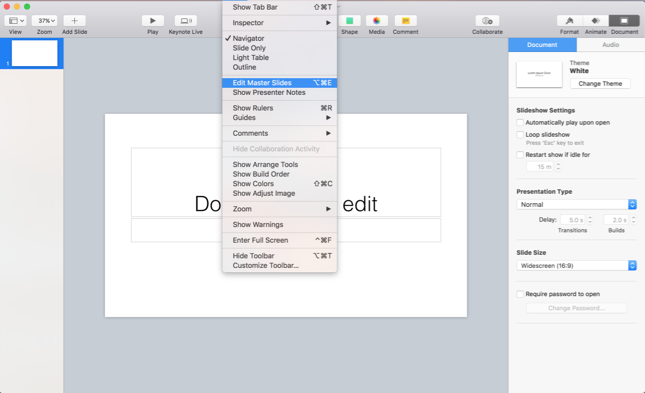
Add a new blank slide to your master deck.
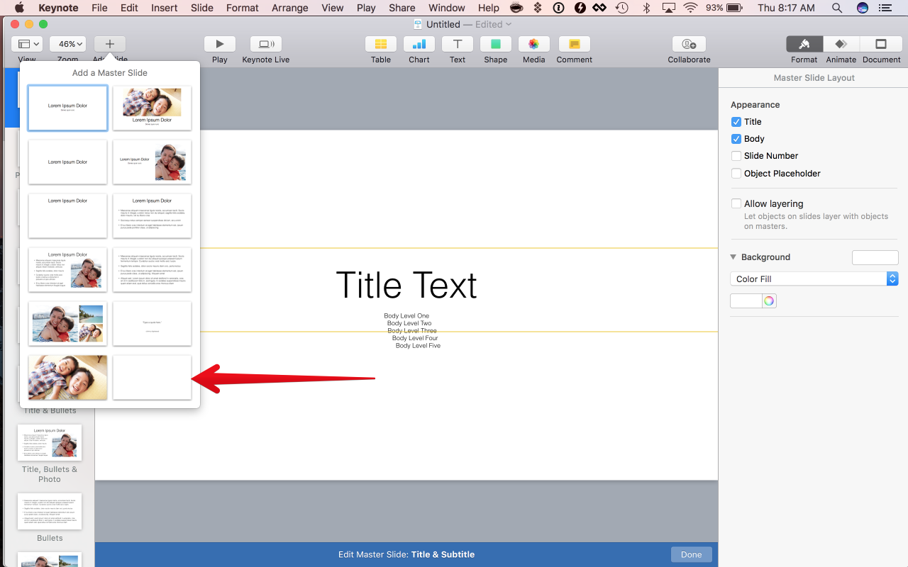
This next step is a little bit weird. We want a 2D text box where we can change the width and height and have the “Shrink text to fit” option on. I don’t have a better way to create one of these other than copy/pasting from one of the other master slides. Your slide should look like this after you paste another title box over.

Next, drag the edges of your textbox to take up the entire slide. We also want to change some settings: update the font to your source code font, use a large font like 150px, align to the top and left of the slide, and change the line spacing to ‘0.9’. This font size normally works well for me but Keynote will only resize it down to something like 30% of the setting you choose so if your examples are long, you may need to lower this a bit. (Reminder: Your examples shouldn’t be long.)

In the “Style” tab, make the text editable by tapping “Define as Text Placeholder”.
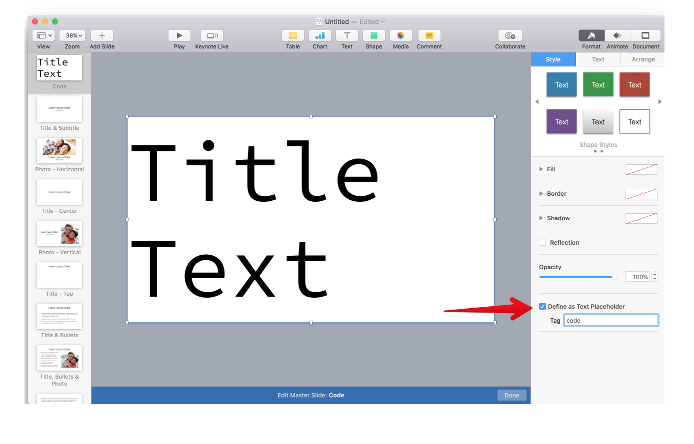
Your master slide is done, let’s add some code examples.
Adding a code example to your presentation
Now that you have your master slide, adding each example is pretty easy!
When you have your example ready, type it out line by line into the text field. The text should continue to shrink as you continue adding new lines. If the lines don’t break correctly (like your class and Dog end up on different lines), add a few new lines at the end until it breaks how you want. When you are done, you’ll have an example that looks something like this:
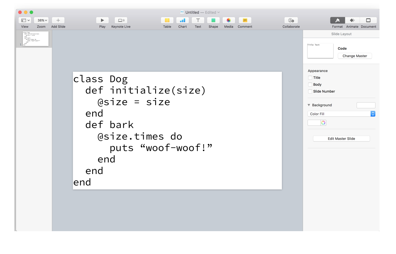
At this point, we have a good-looking code slide and want to focus on how we are going to introduce it.
Duplicate your slide a few times.
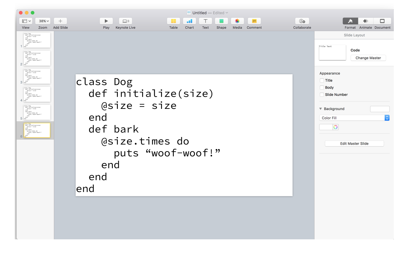
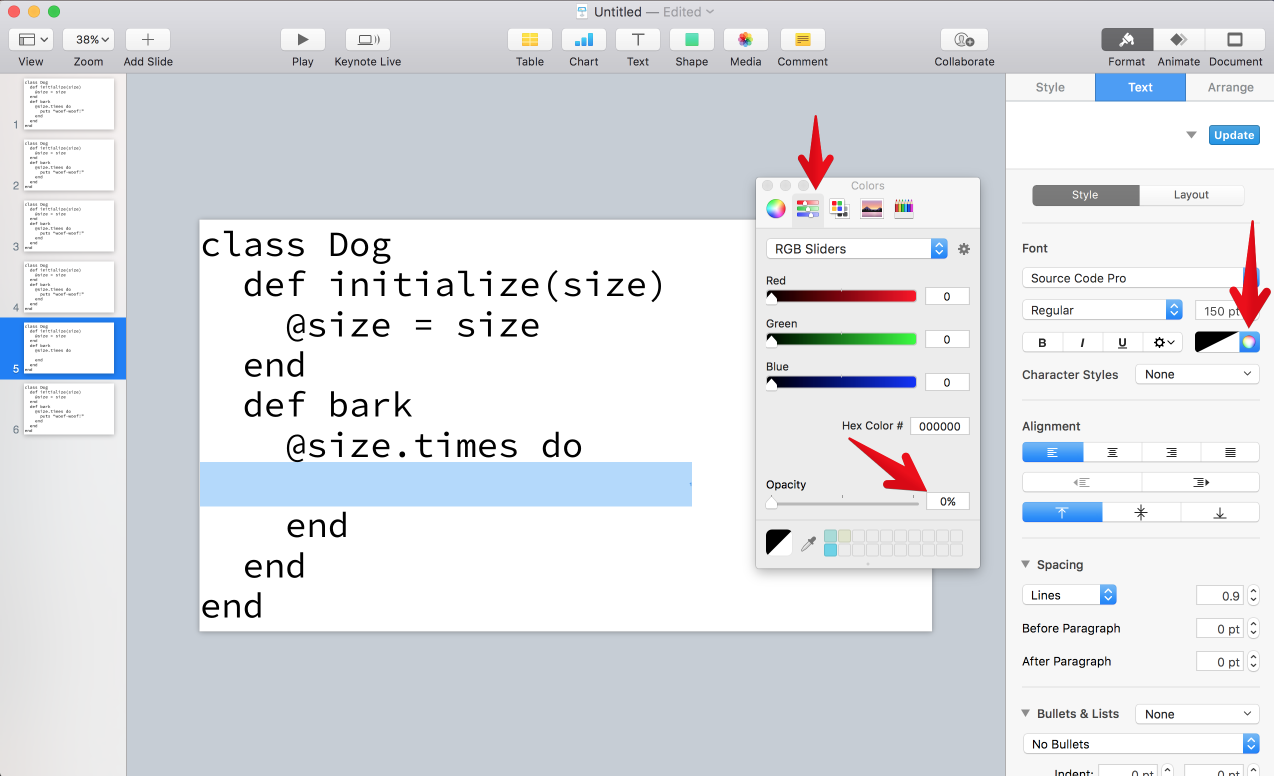
The very last slide will contain the full code example and we are going to work backwards to introduce smaller and smaller bits of code. Go to the previous slide, highlight the next logical bit of code, and make it fully transparent.
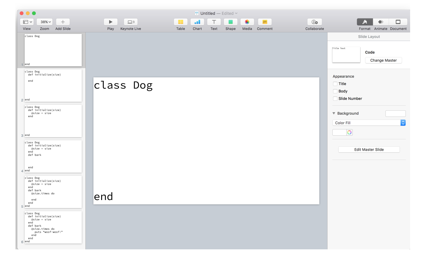
Continue to work backwards until your first slide contains the smallest possible logical block of code. For my example, it’s the class definition. You may need to add a few more slides if you discover you have more logical blocks than you thought. When you’re done, you’ll have slides that look like this:
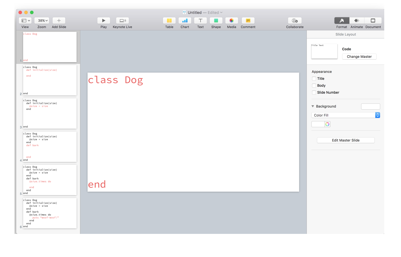
One more technique I like to use is to make the most recent code bold or use a contrasting color. The idea is to make it easy for your audience to find their place if they get lost. Your slides might look something like this after adding some color:
The result

Congratulations! You have conquered Keynote and successfully added some really great looking and easy to understand code slides to your deck. I’m always interested in improving my workflow so please reach out if you have any questions, comments, or ideas of what I could be doing better!


