A lot of web browser technologies added in the last ten years have one thing in common: they give the browser functionality that is already available to native mobile apps. This is a big benefit to the web, but some commentators take it a step further: they claim that the web has entirely caught up to native mobile apps and that there’s no longer any reason to consider building for native mobile.
You may be in a position where you have to decide what you think about this claim. If your opinion is consulted on technology choices for a new app, should you recommend the web categorically, or is there a reason to weigh it against native mobile and look for trade-offs? If you’re looking to learn a first or second software stack, should you consider native mobile technologies, or is the web the clear winner?
In both of these cases, there is still a reason to consider native mobile. It’s true that web technology advancements mean that some use cases that previously required a native mobile app now can be satisfied with the web. But not all use cases are satisfied. Native mobile apps have a number of user experience advantages over the web, and these advantages will persist for the foreseeable future. For some applications (but not all), these user experience advantages weigh heavily enough that native mobile is the right choice.
We’ll take a look at these user experience advantages shortly, but first, a note about takeaways. The point of this post is not that web developers should feel bad about their platform or that they should all stop doing web development in favor of native mobile. On the contrary, the point of this post is to avoid all-or-nothing caricatures of other platforms. A lot of apps need to be on the web and will be great there, and a lot of apps need to be on native mobile and will be great there. You can have a fulfilling career building on either platform—or on both. And when you’re comfortable with the fact that your platform isn’t without trade-offs, your technical recommendations about platforms will be more effective because they are based on weighing all the options.
Now let’s look at some of these trade-offs.
(One brief note: I’m an iOS user, so in this discussion I’ll focus on the trade-offs of the web and native experience on iOS. The trade-offs on Android are not identical, but largely similar: the web won’t replace native Android apps either.)
Offline support
By default, native mobile apps are available even when you don’t have an internet connection, and web apps are not.
If you want to make your web app available offline, you can build support for this with a Service Worker, which allows programmatically downloading and caching code and data. However, if you aren’t careful, it’s possible to accidentally end up stuck in a situation where users have broken code cached forever, and the only way to fix it is for the user to manually clear their browser cache. Many nontechnical users are not going to do that; they’ll just consider your app broken and move on.
Even if you implement offline support for your web app, will users take advantage of it? Well, when you sign in to a web app, do you assume it will be available offline? I’d bet that most of us don’t assume a given web app will be available offline because most web apps aren’t. Since your users share the same assumptions, they likely won’t even think to give your offline functionality a try.
So if you want users to use your app offline and you don’t want to risk users getting stuck with broken code, you have to build a native mobile app.
Home screen icon
On the web, you first get to a web app by clicking a link or typing in a URL. How do you get back to that web app later? Safari for iOS has a Bookmarks list. Some of these Bookmarks are Favorites (the distinction between the terms isn’t obvious), and if you add a site to Favorites, it appears when you open a new tab—unless you add more Favorites than can fit on the page, I think. You can customize this “Start Page” to add other things like frequently visited sites as well. But keep in mind that if you already have the web app open in one tab, clicking a link will open a new tab with a second copy of the app, which can lead to losing your place in the app, cluttering up your tab list, and even data loss.
All this is complex, and I’m not trying to exaggerate it: it actually feels complex when I’m just trying to pull up a favorite web app, and I have to wade through all this.
For native iPhone applications, things are much simpler. When you download an app, its icon appears on your Home Screen. When you tap the icon on the home screen, the app opens, and if the app was previously open, it brings you back to where you left off. It’s easy to get to the Home Screen at any time via a gesture.
Now, there is another option for web apps: “Add to Home Screen” is an attempt to make web apps as easy to access as native mobile apps. But the Home Screen web app functionality has had a lot of issues, as documented by Maximiliano Firtman over the years. Automatic cache clearing can break background processes. Automatic reload on launch can prevent third-party authentication from working. Home Screen apps don’t include browser navigation, so you need to test every screen in your app to make sure navigation still works.
Even if you put effort into making a great Home Screen web app experience for your app, users who have been burned by Home Screen web apps before won’t likely be willing to add your web app to the Home Screen.
So if you want everyone who uses your app to have an easy way to get back to it that doesn’t cause problems, you have to build a native mobile app.
Full-screen control
Browsers present their own UI around a website’s UI: the address bar, navigation buttons, menu buttons, etc. That isn’t a problem on desktops and laptops, but the constrained size of mobile devices means that, once you add your own site’s navigation, there isn’t much room for content.
Mobile browsers attempt to mitigate this problem by intelligently hiding and showing the browser UI. In Safari, when you scroll down on the page, the browser UI minimizes to just show the site URL. In Firefox on iOS, when you scroll down, the browser UI goes away entirely. This frees up some space at the cost of a UX inconsistency: sometimes a UI outside your app is shown, and sometimes it isn’t. When you start to scroll up on the page, Safari and Firefox add the browser UI back if you scroll up quickly but not if you scroll up slowly:

This is an admirable attempt to solve a tricky problem, but it leads to a jarring user experience as the browser UI is frequently appearing and disappearing while I’m just trying to scroll through content.
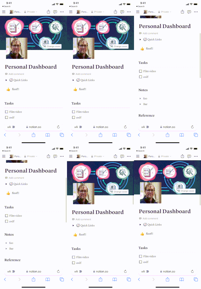
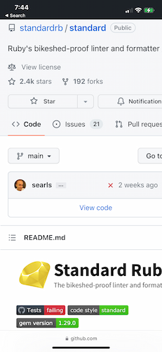
However, depending on how your app’s scrolling is coded, the browser UI may not disappear at all, permanently preventing your app from using that screen space. This can occur in apps as high-profile as Google Drive and Notion:

Contrast this with a native mobile app, where you are fully in charge of drawing your app’s UI. Users consistently see the same navigation in the same place.
There is one way to fully hide the browser UI: saving a web app to the Home Screen. However, in “Home screen icon” above, we saw the problems that come with “Add to Home Screen” web apps.
So if you want to make optimal use of the mobile screen without browser UI popping in and out, you have to build a native mobile app.
Zooming
It’s important for accessibility to be able to resize app content. Safari and native iOS apps have different mechanisms for resizing, and native apps’ mechanism provides more control and is less likely to interrupt the user’s experience.
Safari for iPhone shipped with the ability to pinch to zoom into web pages, allowing users to read web pages that weren’t designed to fit mobile screens. Since then, there’s been a shift to mobile-first responsive design, in which your site intelligently arranges content for any screen size.
For mobile-first sites, zooming is no longer necessary, but the browser still allows pinch-to-zoom. This can result in users accidentally zooming into your site and then being confused about why parts of your app’s UI go off the side of the screen:

There are ways to turn off pinch-to-zoom, but doing so gets in the way of visually-impaired users viewing text at a larger size. As a result, developers are rightly encouraged to keep pinch-to-zoom enabled.
Does this mean the web is more suited for visually-impaired users than iOS? No. iOS allows you to adjust the system text size, including very large sizes if an accessibility setting is chosen. Apps that are written according to Apple’s recommendations will display text at the configured size and intelligently lay out the UI in a way that preserves the intended user experience:

Problems with zooming aren’t limited to when the user pinches to zoom. If you tap on a text input field whose text size is less than 16 pixels, Safari automatically zooms in to ensure it’s big enough for the user to see what they’re typing. Text under this 16 pixel limit often appears “big enough” on desktops, so it’s common for developers to create text fields that trigger this zooming without realizing it.

When you discover this is happening, it’s easy enough to fix by increasing the font size—for text fields in your own web app. But if you integrate with a third-party web app (for example, for OAuth 2.0 sign-in) you don’t have direct access to resize its text fields, so you will be stuck with any zooming that happens until you can convince the third party to fix it.
So if you want your users to have a predictable way to experience your UI on a mobile screen, you have to build a native mobile app.
Device integrations
Native mobile apps have more device integrations available than web browsers. Mobile OSes expose all the device’s features, whereas browsers limit the functionality they make available—either for security or because an API hasn’t been created yet. While some device features aren’t needed by most applications (like ARKit or the gyroscope), others are more often useful. For example, let’s look at like push notifications and share extensions.
Most mobile users are familiar with notifications: the pop-up bars that inform you that something’s happened in an app you have in the background. Native mobile apps have had push notifications since iOS 3 in 2008, and desktop web browsers have had push notifications for years as well—but they have been conspicuously missing from iOS Safari. Finally, this year, iOS 16.4 added support for web push notifications—fifteen years after iOS 3! But even now this support is limited: it only works in the problematic “Add to Home Screen” mode.
Share extensions allow you to take content in one app and share it in another: posting it to social media, emailing it, or storing the file in another app.

The web has a share_target API that allows websites to receive sharing requests, but it is experimental, and the only major browsers that currently support it are Chrome and Edge.
So if you want to ensure your users can receive push notifications or share content into your app while on their mobile device, you have to build a native mobile app.
Full control of gestures
Native mobile apps have full control of how they respond to users’ touch gestures, whereas web browsers come with some pre-configured gesture responses that may cause problems for your app.
In iPhone browsers, when you’re scrolled to the top of a page, pulling down refreshes that page. Swiping from the left or right side of the screen navigates back or forward through your browsing history. Apps may use gestures that are similar to these, and if the user accidentally performs a browser gesture instead of an app gesture it could result in unintentional page navigation and possibly data loss. This is a big risk in apps that are heavily gesture-based, such as drawing apps, but even something as simple as scrolling up, left, or right can result in unintentional navigation.
In browsers, a long press selects text. This is a gesture that is easy to do accidentally, and it can be distracting because it makes your app’s user interface look like a text document being edited. In native mobile apps, a long press is treated as a normal press by default, which is likely to do what the user expects.
So if you want to ensure users’ gestures won’t lead to a bad experience, you have to build a native mobile app.
What to do about mobile
When someone suggests that there are no trade-offs, the idea is appealing. If it’s true, you don’t have to go through a risky decision-making process and later be tempted to second-guess your decision. You don’t have to augment the gaps in your own knowledge by finding trustworthy people who can provide that knowledge.
Unfortunately, things aren’t that simple: there are trade-offs when it comes to the web and mobile. This post examined user experience advantages that native mobile apps have compared to the web: offline support, home screen icon, full-screen control, zooming, device integrations, and full control of gestures. Let’s assume you find these points convincing. Where do you go from here?
Here are a few ideas for how you can apply this perspective on web and mobile apps:
- Your career: you can resist feeling judged for being a web developer or pressured to learn native mobile development; native mobile won’t replace the web either.
- New web APIs: you can measure them not by the absolute standard “does this replace the need for native mobile apps?” but instead by the relative standard “how does this make the web experience better?”
- Advising on new projects: as you evaluate technology stack options, you’ll have the freedom to ask “for this project, organization, and industry, what are the costs and benefits of building a web app vs. a native mobile app vs. both?”
- Your learning: if and when you’re looking for something to stretch your brain, you can consider choosing a native mobile development framework and giving it a try. The things you learn will help you build better apps on any platform.


